How to use the Accessibility Widget
 GRID-ARENDAL · READING YOUR WAY
Make this website work better for you
Your guide to the Accessibility Widget: adjust text, colour and focus, with settings you can change or reset at any time.
Open the round Accessibility button near the bottom-right corner and try the controls as you read.
Getting started
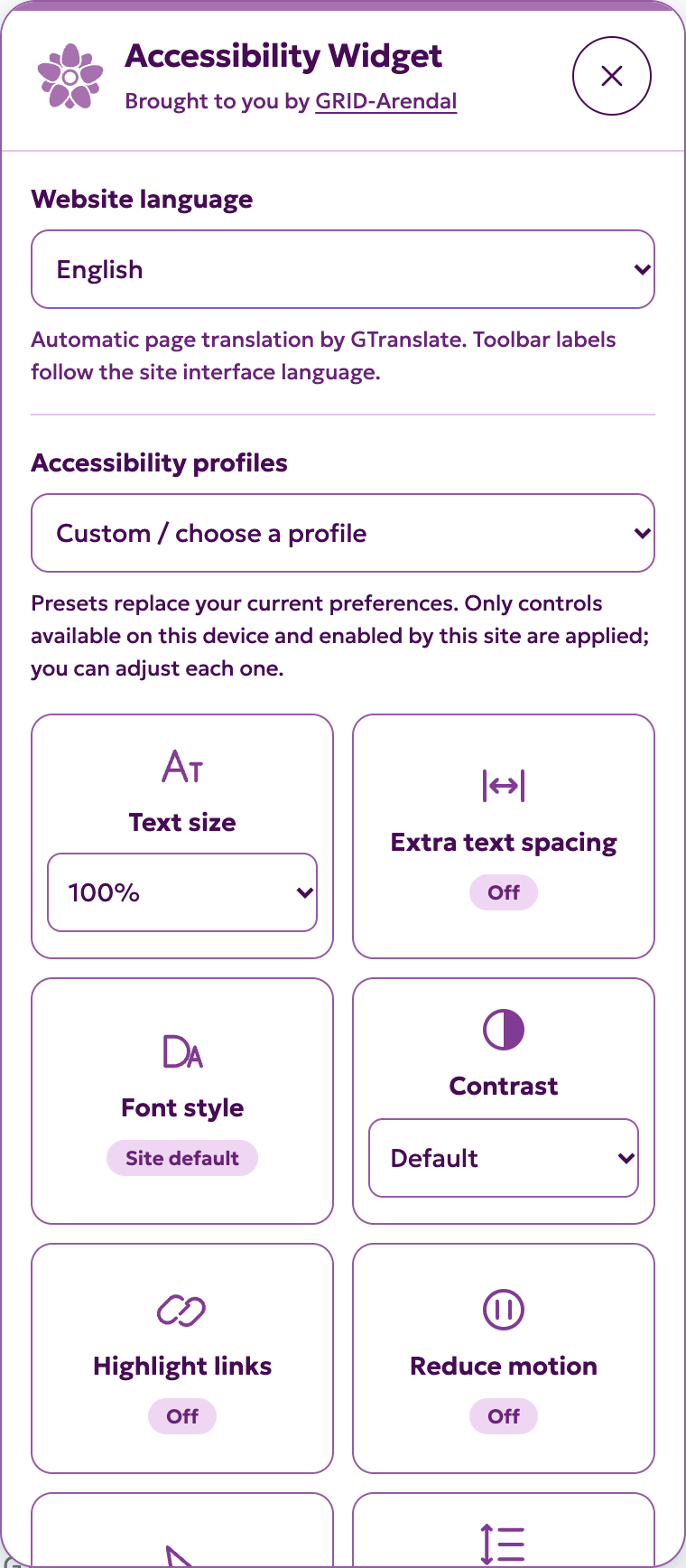
- Select the round Accessibility button near the bottom-right corner. On sites configured differently, it may be on the left.
- Choose a profile as a starting point, or scroll through the controls and adjust them individually.
- Buttons with an On/Off indicator toggle a preference. Font style and Reading aids cycle through several choices; the current choice appears on the button. Other tiles use a dropdown.
- Close the panel to give yourself more reading space. Your adjustments stay active.
- Choose Reset preferences in the panel to return to the website’s original presentation.
Using a keyboard: press Tab until you reach Accessibility, then Enter or Space. Tab moves through the panel and the page; Shift+Tab moves back. Use arrow keys in dropdowns and sliders. Escape closes the panel and returns to the opening button. The panel does not trap keyboard focus.
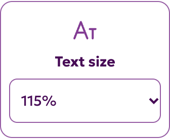
Try this: open the widget, select 115% text size, then try Extra text spacing. Compare the result with the original by using Reset. Browser zoom remains available if you need more magnification.
Every control explained
Site administrators can hide individual controls. On touch-only phones and tablets, the widget also hides the large cursor, reading mask, reading guide and hover tooltips. These rely on pointer interaction. The other controls remain available, and profiles skip unavailable features. The descriptions below cover the full set on devices with a mouse or trackpad.
Website language
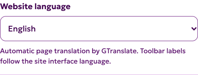
Choose a language from the dropdown at the top of the panel. This test site offers all 104 choices available in its installed GTranslate version. English is the starting language for a new visitor; a previous language choice may be remembered. Select English to restore the original page. The widget’s own labels remain in English here.
Why offer it? Reading in a familiar language can make information more usable. This is automatic page translation, with possible errors in terminology and meaning; it is not an accessibility or accuracy guarantee. Important information should be checked against the original. W3C cognitive accessibility guidance supports understandable content; GTranslate’s publisher documentation explains the translation service, rather than providing independent research on this widget.
Text size
Select 100%, 115%, 130% or 150%. The widget enlarges supported page text relative to its original size. It does not enlarge text inside images, embedded documents or every interactive graphic. Use your browser’s zoom or your usual magnifier when you need more.
Reason and evidence: appropriately sized text matters for low-vision reading, but larger is not always better for every reader. Legge’s open research review, Reading Digital with Low Vision, discusses size, spacing and contrast. W3C’s Resize Text explanation describes why websites must support enlargement; the widget’s 150% option does not replace that requirement.
Extra text spacing
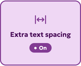
Switch on to increase letter spacing, word spacing and line spacing. Text size stays independently adjustable. Turn off to restore the original spacing. A separate Line height choice takes priority over this control’s line-height adjustment.
Reason and evidence: some readers find less crowded text easier to read. Zorzi and colleagues’ open study found benefits from extra letter spacing for the children with dyslexia studied. That result does not establish a benefit for every reader, language or spacing amount. W3C Text Spacing guidance explains the need to tolerate user adjustments.
Font style: OpenDyslexic, Arial or site default
Click once for OpenDyslexic, again for Arial, and again for Site default. OpenDyslexic uses distinctive letter shapes. Arial is a conventional sans-serif option; its difference may be subtle on a website already using Helvetica or Arial. The fonts load from this website, not an external font provider. These options do not automatically change text size or spacing.
Reason and evidence: font choice is offered for personal preference, not as a treatment. Wery and Diliberto’s open OpenDyslexic study found no improvement in reading rate or accuracy in its participants. The “Dyslexia Friendly” name describes the option, not a proven outcome. Try Arial or the original font if either works better for you.
Contrast
Choose Default, Dark or Light. Dark and Light apply alternative text/background palettes and remove supported background images. Return to Default for the theme’s colours. Some content may look different or lose meaningful background imagery.
Reason and evidence: low-vision readers have varied needs for contrast and light/dark presentation. Legge’s review explains the role of contrast and contrast reversal. These are optional palettes, not “smart” per-element contrast repair or a contrast audit.
Highlight links
Turn on to underline and outline page links, making them easier to distinguish from surrounding text. It does not change where links go or improve unclear link wording.
Reason and guidance: colour alone is not a dependable signal for everyone. W3C Use of Color guidance explains the need for additional visual cues. This is standards-based rationale, not a clinical finding about the widget.
Reduce motion
Turn on to stop supported CSS animations, transitions and smooth scrolling, and pause native HTML video. Turning it off does not automatically restart paused video: use the video’s own play control if wanted.
Reason and guidance: motion can distract readers or cause discomfort. See W3C Animation from Interactions and Pause, Stop, Hide. GIFs, canvas animation, script-driven effects and embedded media may continue. This control does not make a page seizure-safe.
Reading aids: cursor, mask and guide
Repeated clicks cycle through Large pointer → Reading mask → Reading guide → Off. One aid is active at a time.
- Large pointer: makes the supported mouse pointer more prominent. This can help you locate it; touch-only devices may show no change. The rationale is pointer visibility, described in the W3C low-vision user-needs draft. This is guidance rather than a clinical evaluation of our pointer.
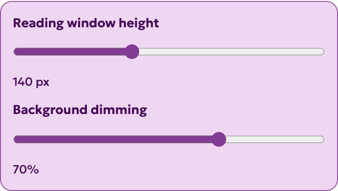
- Reading mask: dims the page above and below a clear horizontal reading window. While it is selected, adjust Reading window height (80–240 pixels) and Background dimming (40–85%) in the panel above the control grid. It follows pointer/touch position and keyboard focus outside the panel. Page links remain clickable.
- Reading guide: adds a horizontal line to help mark your place. Move the pointer to position it; keyboard focus also updates its position. It is a visual aid, not spoken reading or an automatic reading-speed tool.
Reason and research for the mask and guide: digital rulers can help some people track text. Niklaus and colleagues’ open CHI 2023 paper (PDF, 17 pages) found reading-speed gains for some ruler designs among participants with dyslexia, without significant comprehension gains. Designs and preferences differed. It did not test this widget, so these findings justify offering a choice rather than promising an improvement.
Shown on devices with a mouse or trackpad. Hidden on touch-only phones and tablets.
Line height
Choose Default, Comfortable (1.5), Relaxed (1.8) or Loose (2.0). This changes the space between lines independently of text size. A chosen value takes priority over the line spacing included in Extra text spacing.
Reason and evidence: extra vertical space may help readers distinguish lines, although individual needs vary. See the low-vision reading review and W3C Text Spacing guidance. Fixed-height website elements can still need design repairs.
Text align
Choose Default, Left, Center or Right for supported page text. Default restores the original alignment. Use the arrangement that matches your reading direction and preference.
Reason and guidance: predictable word spacing and line edges can help reading. W3C Visual Presentation guidance explains problems with fully justified text. It does not establish centred or right-aligned paragraphs as better for everyone.
Saturation
Choose Default, Muted images, Grayscale images or Vivid images. These change supported visual media such as images and native video; they do not recolour all page text.
Reason and limits: visual intensity is a preference. We have no direct evidence that these particular filters improve reading or correct colour-vision differences. W3C Use of Color guidance explains why meaning must survive without colour. A filter cannot add missing chart labels, patterns or explanations, and may make some images harder to interpret.
Hide images
Turn on to make supported content images transparent and remove supported background images while keeping their layout space. Functional image controls and excluded areas remain available. Alternative text is not deleted, but may not become visible as a replacement caption.
Reason and guidance: reducing visual clutter is an optional way to support concentration. W3C’s cognitive accessibility guidance discusses distractions and personalisation. This is a practical preference, not a proven ADHD treatment. Images can contain important information; turn them back on when needed.

Tooltips
Turn on, then hover over or keyboard-focus an element that already has an author-supplied title. A readable tooltip shows that text. Escape dismisses it. The control cannot invent explanations for elements without a title.
Reason and guidance: existing hints should be available predictably to pointer and keyboard users. W3C Hover or Focus guidance explains why extra content must be dismissible, hoverable and persistent. Try the getting-started link with an example tooltip.
Shown on devices with a mouse or trackpad. Hidden on touch-only phones and tablets.
Page structure
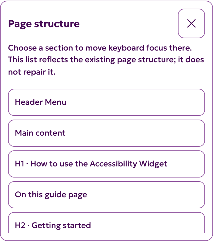
Turn on to see a list of visible headings and main/navigation landmarks. Select an entry to scroll to it and move keyboard focus there. Close the outline or turn the control off when finished.
Reason and guidance: a page outline helps people locate and revisit sections. W3C Headings and Labels guidance explains the value of descriptive structure. The outline reflects the page’s existing markup and cannot repair missing headings or inaccessible menus. It does not replace a screen reader.
Strong focus
Turn on and press Tab through the page. A stronger outline helps show which supported link or control will respond when you activate it.
Reason and guidance: sighted keyboard users need to see their current position. W3C Focus Visible guidance explains this need. The outline does not make an otherwise inaccessible control keyboard-operable.
Accessibility profiles
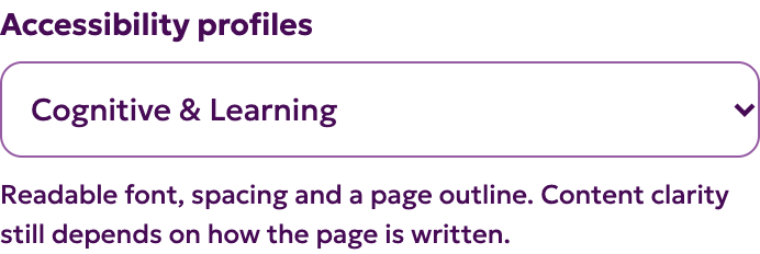
Profiles are convenient starting combinations, not diagnoses or medically validated accommodations. Selecting one replaces your current reading settings. Adjusting a control afterwards changes the selector to Custom. Only controls enabled by the administrator are applied.
- Motor Impaired: large pointer, highlighted links, strong focus and reduced motion.
- Blind: page structure and strong focus. Continue using your own screen reader; this profile does not supply speech or repair semantics.
- Color Blind: light contrast, highlighted links and strong focus. Colour-only diagrams still need accessible explanations.
- Dyslexia: OpenDyslexic, 115% text, extra spacing, relaxed line height and left alignment. Replace any option that does not suit you.
- Low vision: 150% text, dark contrast, highlighted links and strong focus. Browser zoom and your own magnifier remain useful.
- Cognitive & Learning: Arial, 115% text, spacing, relaxed line height and page structure.
- Seizure & Epileptic: reduced motion and hidden images. Some motion can remain; this is not a seizure-safety guarantee.
- ADHD: reading guide, reduced motion, hidden images and relaxed line height. This is a focus preference, not treatment.
Evidence boundary: research and guidance linked for the individual controls explain why choice can be useful. They do not validate these eight named bundles. W3C cognitive accessibility guidance supports personalisation and user choice.
Saving, privacy and reset
When remembering is enabled, reading preferences are saved in this browser for this website. The widget stores the settings themselves, not the selected disability/profile label. Reset preferences restores defaults and removes the saved reading settings. If storage is blocked, controls still work for the current visit.
Translation is separate: GTranslate/Google loads external services and can send page text and connection information to its providers. It can remember your selected language independently. Reset preferences does not reset translation; choose English in Website language instead.
If a control is unhelpful, turn it off or reset. The widget does not provide a screen reader, read-aloud, voice navigation or a dictionary, and cannot make PDFs, captions, forms or underlying website code accessible. It does not certify WCAG compliance. Accessibility also depends on the website’s design, content and testing.
